MONICA MAGLIARI . NYC

PROJECT: Website audit, redesign & high-fidelity Figma prototype | TOOLS: Figma, Figjam, Optimalsort, Adobe Creative Suite, Google Suite
2023
RESEARCH
SCOPE
PROJECT
HIGH-FIDELITY PROTOTYPES
PRODUCT-
This is the DISPATCH, information

This is WORKFLOWS, information


This is the CUSTOMERS, information

This is the SUBSCRIPTIONS, information

This is the ONBOARDING, information

This is the DASHBOARD, information

DESIGN
PRODUCT


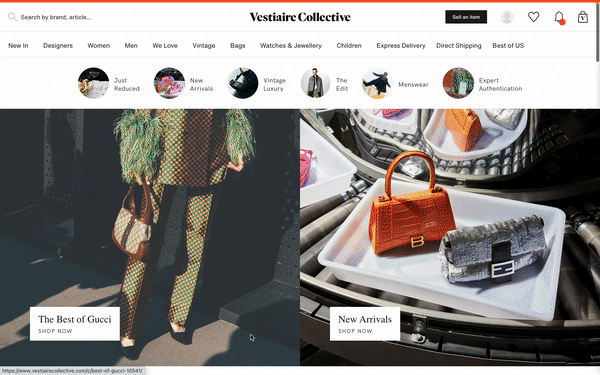
Vestiaire Collective, est. 2009, is an online luxury fashion resale platform headquartered in Paris, France. With a massive community of over 23 million members worldwide, Vestiaire has established itself as one of the leading digital marketplaces for pre-loved fashion, allowing users to buy and sell high-end, hand-authenticated items to a globally-spanning network of customers.
As the secondhand clothing business has become a mainstream part of the fashion world, more and more companies are vying for a stake in the industry, which, in 2021 alone, was estimated to be valued at more than $96 billion USD.
Proactively taking the steps to remain a frontrunner, Vestiaire wants to refine its UI to create a seamless, delightful, and easy-to-navigate experience for its users, ensuring that the site will continue to procure and retain both buyers and sellers in such a competitive market.
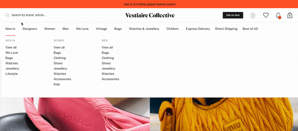
STRUCTURE AND CONTENT AUDIT
Vestiaire presents itself in a fairly standard manner, utilizing categorical top navigation and glossy hero images consistent with most high-end e-commerce platforms, followed by sectioned rows of product recommendations and blog-style fashion edits.
Overall, the site appears sufficient with no major glitches or glaring UI missteps. Upon deeper inspection, however, I was able to pinpoint numerous areas in need of refinement, namely the information architecture within the megamenu, the consistency of breadcrumb navigation, the excessive volume of product filters, and the formatting of individual product pages.

LISTING PROCESS AUDIT
Throughout my research, I came across a number of site reviews from users who felt that the Vestiaire platform, though satisfactory from a buyer's standpoint, was not designed with the seller in mind. The primary complaint was that the listing process provided a sub-par experience and was far too effort-intensive. In the gallery below I break down a few of the particularly ineffective parts of the flow.
TO SUMMARIZE:
INCONSISTENT & INACCESSIBLE SITE NAVIGATION
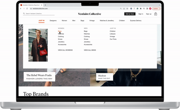
To ensure that customers would be able to successfully navigate the site, my first order of business was to revise the content of the primary navigation, tackling both the main product categories as well as the subcategories contained within the megamenu. Secondly, I sought to unify the structure of all breadcrumb navigation, making the trails consistent across the site.
How can we redesign the menu in a way that emphasizes certain categories without relying on repetition?
1.
EXTENSIVE, OVERWHELMING FILTER OPTIONS
The most glaring UI fumble I came across in my audit of the product gallery was the enormous quantity of filter options displayed. With over 18 primary filter fields, Vestiaire presents its user with an overwhelming load of choices, detracting attention from the actual product.
What does it look like to prioritize key filters while still providing easily accessible options for advanced search?
2.
OVERCOMPLICATED LISTING FLOW
Finally, the "Sell an Item" flow needed to be streamlined significantly, trimmed down from six full pages to one concise, easy-to-complete form.
How might we revise the listing flow to make it as simple and intuitive as possible?
3.
As the majority of structural adjustments to the buyer-facing site pages could be fixed with tried-and-true UI methodologies, it was important to use my time and resources to investigate Vestiaire's most significant pain point, the listing flow. Through competitive feature analysis, user feedback, and focus interviews, I was able to identify key elemental differences between Vestiaire's process and those of its top competitors in the resale space, as well as points within the flow that posed challenges for their users.


USER INTERVIEWS & RESEARCH SUMMARY
I conducted sessions of moderated user testing with a group of 10 individuals who regularly buy and sell clothing online. I tasked them with completing the listing process from start to finish and asked them to verbally describe their thoughts and experiences throughout. All participants mentioned that the process was much longer and more involved than what they were used to. Other notes included that the order of steps was strange and that the information they were asked to input seemed odd or unnecessary. More than anything, participants reported that their experience with uploading product photos was negative, as the process was too tedious.
When asked about the listing flow they had just completed as compared to those of competitor platforms, testers said:
ANDREW M.
"It makes absolutely no sense to make people upload each photo individually.
Even Depop, which only allows for 4 photos, lets you upload them all at once."
MATTEO G.
"I don't like how [Vestiaire] doesn't give you the option to turn offers on or off. I sell luxury items and oftentimes buyers will try to lowball me if I have offers turned on."
ALANA R.
"It just takes so long to complete the form. I would go crazy listing every item on here. Especially when it comes to uploading photos!"
USER FLOW DESIGN
Before diving into wireframing and mockups, I needed to take a closer look at the process of listing an item on the site in order to pinpoint precisely where revisions were needed. After mapping out the steps, I was able to edit and restructure the flow to accommodate the needs of my user: simplicity, clarity, and ease of use.
Below are two versions of the "Sell an item" user flow; while both are fairly linear, the original version (top image) is much longer and more complex than its successor. Click on the images below to view flows and notes in full scale.

WIREFRAMING
Having thoroughly analyzed my research, I began the process of sketching low-fidelity wireframes for each page, iterating on them with mid-fidelity mockups for testing, and eventually translating them into high-fidelity prototypes designed in accordance with the Vestiaire site style guide.
PROTOTYPING AND TESTING
Using Maze user testing software, I conducted moderated A/B testing with 7 participants in order to gather feedback about the site redesign. For these tests, users were presented with a series of tasks asking them to complete flows on both the live version of the Vestiaire website and again on high-fidelity Figma prototypes. They were also asked to rate their experiences and provide verbal feedback aloud. Below are the results of both the "Discovery & Navigation" flow, as well as the "Sell an Item" flow. Overall, the models demonstrate clear ease of use and general satisfaction with the prototype; in both, 100% of users were able to successfully complete the tasks with a 0% bounce rate.


VESTIAIRE STYLE GUIDE

Click into the gallery above to see all page redesigns at scale
VESTIAIRE COLLECTIVE HOME PAGE
-
This simple homepage redesign features refined top navigation with fewer, more relevant product categories. In addition, I added more obvious hover states to existing elements and alt text to hero images to allow for more accessible navigation by users who might be of low vision or using a screen reader.
-
Vestiaire edit tags have been repositioned to avoid detracting from critical product information.
-
I reprioritized the order and content of editorials to promote relevant products rather than site and staff-centered news; in lieu of the "WE LOVE" block of product cards, I used this space to create a social media-style collection of edits that reflect trending style tags. This approach offers a more personable and enticing way of presenting curated product.

PRODUCT GALLERY
-
Minor adjustments have been made to incorporate the appropriate breadcrumb trail and page number navigation with category filters and sorting options correctly applied.
-
Perhaps the most significant change made to this page lies within the product filter options to the left-hand side of the gallery. After analyzing the filter systems of 10+ luxury and secondhand e-commerce sites, I was able to drastically reduce the cognitive load Vestiaire initially placed on users by condensing lesser-used filters into accordions and prioritizing critical figures like "Price" and "Color", rather than "Previously sold products" or "Products from brand partners".
PRODUCT PAGE
-
My priority here was to ensure that the product photos and basic information in the upper section were able to fit onto the screen without requiring the user to scroll. By repositioning breadcrumbs and the large header-style brand name to more conventional positions, I was able to make better use of the screen real estate.
-
In the “Details” section that follows, I repositioned the descriptive product information to fall immediately below the title, price, and basic product description, keeping it within the user's direct line of sight while scrolling. Conversely, I shifted the more technical policy and seller-centric content to the far right of the screen, allowing it to remain accessible to the user without unnecessarily drawing their attention away from the product.
-
This same approach was taken when arranging the item’s comment section, placing it lower on the screen, though still within one scroll’s distance from the item card. Above “comments”, we have a selection of related products that encourage further shopping, and below, a “recently viewed” section allowing for our user to easily resume a previous journey.
_gif.gif)
ITEM LISTING FLOW
• My foremost objective was to refine the process, trimming it from 6 full pages into 1 streamlined, intuitive flow. To achieve this, I began by assessing the existing architecture and eliminating or tucking away some of the lesser-used product categories, simultaneously grouping and prioritizing input fields that collect key product information.
• In the original flow, users were required to painstakingly upload photos one by one into different categories at multiple steps in the process. Rather than keep this click-intensive procedure, I implemented a drag-and-drop photo space that allows the user to mass-upload photos (one time!) and categorize them after they’ve been uploaded.
• I allowed users to toggle on/off the option to accept offers. To supplement offers, I wove in a feature commonly offered on competitor sites that allows sellers to establish a set “floor price” for their products, explicitly permitting the site to gradually lower prices on their behalf up to a certain point. Implementing this system not only allows users to get a good deal from the seller without having to haggle, but it also provides a definitive “yes” or “no” to Vestiaire regarding a seller's willingness to budge on pricing.

CONFIRM ADDRESS AND ITEM LISTING
Finally, the last step of the flow is to preview the item listing and confirm a shipping address. Here, these are arranged to fall in the logical order of operations and have beenamalgamated to fit on a single page.
After the seller has submitted their listing for review, they are shown a confirmation page that, once again, shows a preview of their listing, allowing them to make any last-minute revisions before exiting the page.

OUTCOME AND RESULTS
Ultimately, the site redesign will make for a more intuitive and enjoyable shopping experience for our users. With simplified navigation, refined product filters, and more relevant recommended content, a successful outcome should present as increased page traffic with an influx of item listings and a higher volume of product sales. New and veteran sellers alike will find the redesigned Vestiaire listing process to be simple and easy to use, encouraging client retention. To measure the effectiveness of the flow redesign, we will track site metrics for listed items, namely: the number of items listed daily; the amount of abandoned (draft) listings; and the number of successful submissions that do not require revision. Additionally, UX and PR teams will monitor customer feedback to record user satisfaction levels.
-